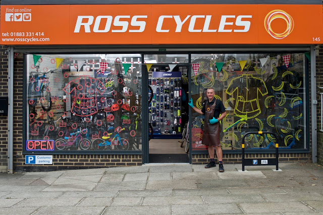
A while back Ross at Ross Cycles talked to me about his website. He wanted to personalise it. Emphasise him as the face of the shop.
One of his advantages over bigger establishments is that he is there when you visit. He will do the work on your bike. He'll remember the last time work was done.
You'll likely be dealing with different people every time you visit one of the chain stores, and they may not be as passionate about bikes as Ross.
Sometimes I just go in to talk bikes, or the rides he organises. I wouldn't do that with the chain stores. It's handy that he is only a few minutes walk from my house.
The big companies have left my area. They have moved away to retail parks.
I started to think about what shots would be needed. I had also to consider how bright the day would be; Ross wanted a shot of the exterior, I knew the interior would need extra illumination. Hiding the two flashes and bouncing the light off the ceiling worked, after a little experimentation.
There is a section on the website listing the many workshop packages on offer. They all had the same image. I wanted to add variety to the page.
And lastly some close-ups.
Like me, Ross doesn't feel comfortable in front of the camera. For this reason I shot the exterior first, then shots of him working on the bikes. Only when he had relaxed a bit did we do the close-ups.
Please add your address to my mailing list, or click the follow button to be kept informed about future posts.
Follow me on twitter.
Leave a comment about this post. I would really appreciate your thoughts on this or any blog post.
For more of my work, go to my Facebook page.


No comments:
Post a Comment